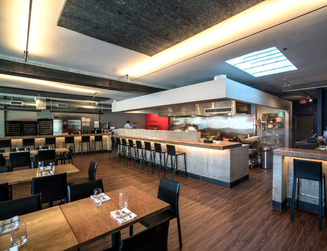
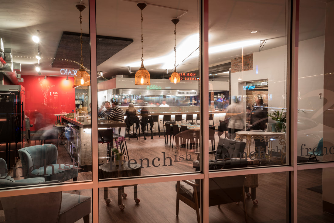
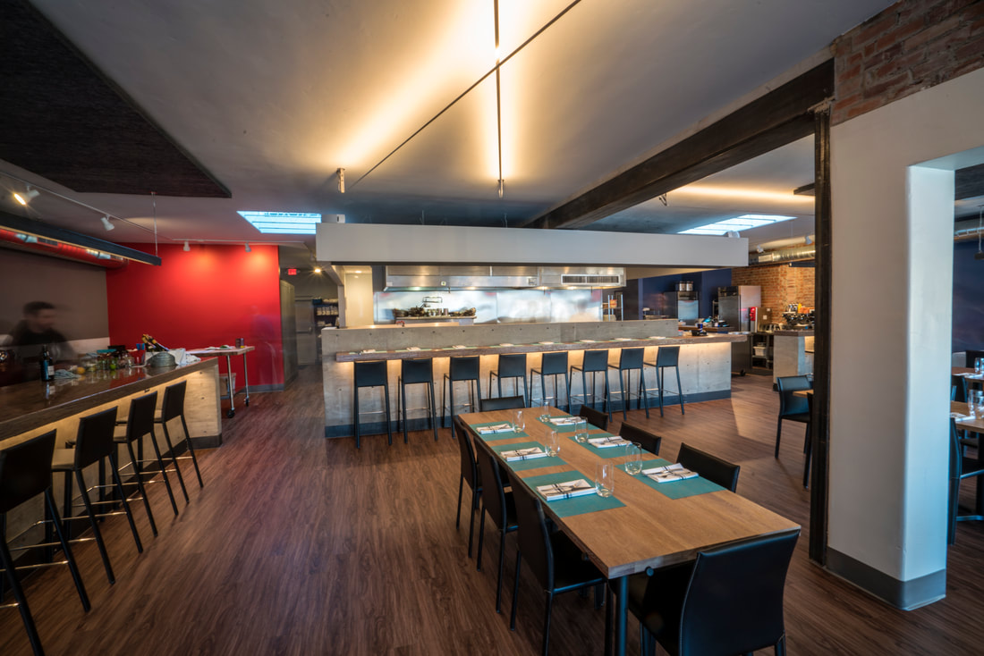
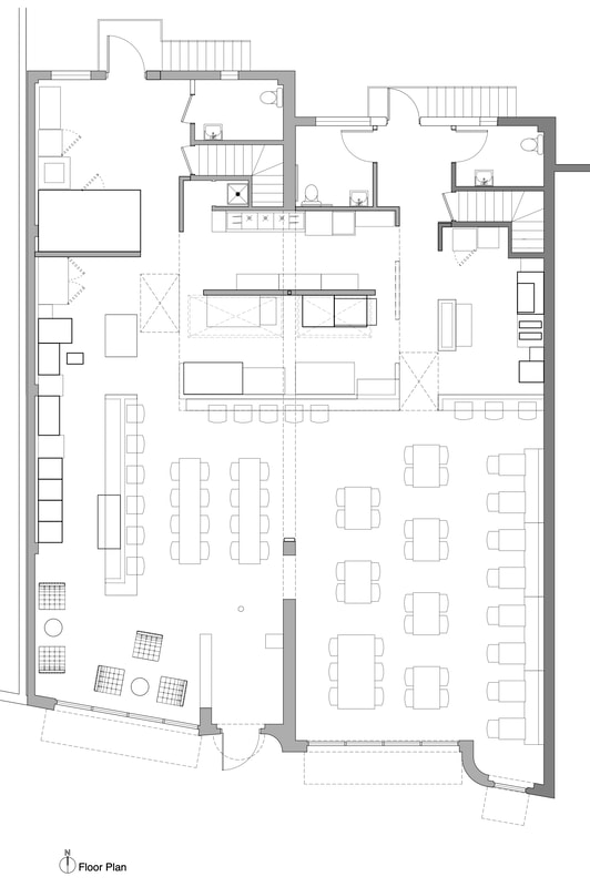
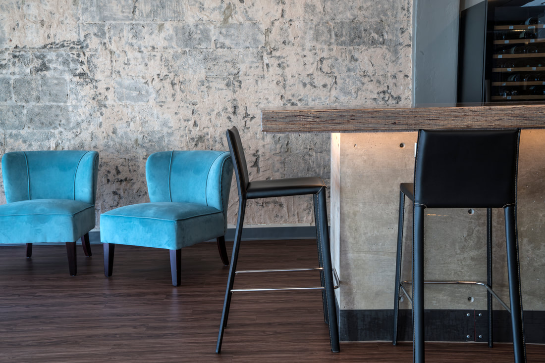
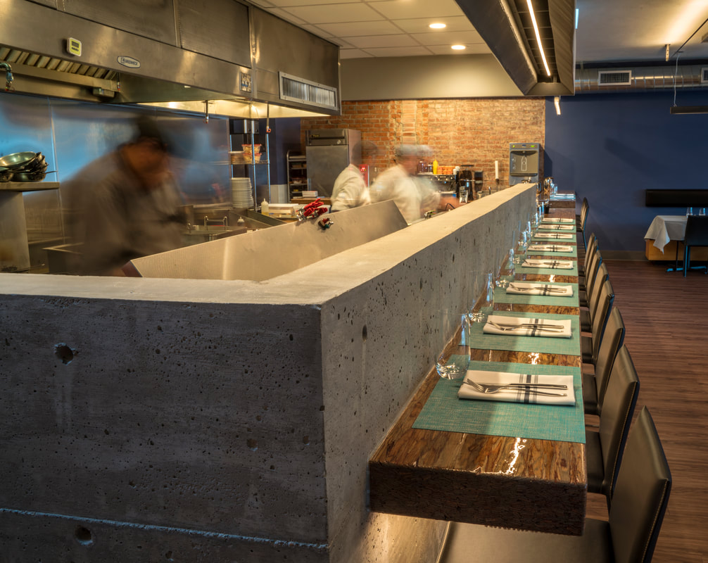
French(ish)Built in the 40's, the property's 50 ft long south-facing storefront looks over a section of Rt 66 in the center of Albuquerque's Nob Hill District. The restaurant's carefully-selected red awnings over a muted french blue facade simply and boldly differentiates within the mix of neighborhood storefront styles. At night, interior linear lighting, visible through the glass, evokes Rt 66 car culture of headlights in motion and neon graphics. With a particular interest in de-formalizing the atmosphere, we selectively exposed the building's historic materials while allowing for visible rawness of new structure and surfaces. Communicating the anatomy of the renovation, the design is a considerate dialogue between new work, timeless materials and intentionally ornate touches. Client-made furniture, grey-stained parallam countertops, cast-in-place concrete, selectively exposed masonry, and the spark of gilded accents subtly distinguish the pair of volumes. |
|
With the pressure of a restaurant revenue driving the schedule, the client+architect design team dove into a quick-on-the-feet collaborative decision process with our engineers and contractor. We prioritized the fastest reasonable solutions that would satisfy permit requirements before fully resolving all design decisions. The best solutions to the challenge of creating a restaurant from a former retail space were straightforward modifications to exist building systems, while increasing their capacity.
|

